Pinned - Design for America
Role: UX Designer
Duration: January 2024 - June 2024
Tools Utilized: Figma
Application Type: Mobile
Background
Design For America (DFA) is an nation-wide nonprofit organization. They teach human-centered design to students and community partners to solve social challenges. I was recruited to join a team within DFA as a UX designer alongside 5 other designers. This project took place over the course of 6 months. There is no predetermined prompt. Each team meets with their team leader weekly, and comes up with a design project based on market analysis and personal interests. The problem space was difficult to come up with and took a lot of brainstorming. After a few iterations, my team and I determined that the current market doesn’t contain a lot of ‘travel journaling’ and ‘memory recollection’ applications, containing both features in one.
How might we design a solution for users interested in documenting their travels so that they can easily revisit their memories from the past?
Problem SatEment
Market research revealed competitor applications with unique features, but a lack of integration into one application. My team and I decided that we could create an application which checks off many boxes at once when it comes to travel journaling and memory recollection.
Suggested features for our app from survey findings included:
Voice notes
Categorizing photos by trip
Mapping journeys on a map
Easy navigation
Memory reminders
Photo information/details
In-Depth Interviews
Key findings from interviews included:
People were interested in ‘categorized photos’, ‘voice notes’, and ‘emotion stickers’.
They found search features to be essential and valuable for photo location.
One potential user suggested geotagging which we would implement as one of our features in our finished application.
Market Research
Research
Surveys
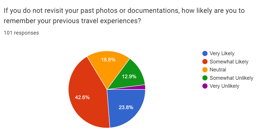
A survey was sent to fellow students, friends, family, social circles. 101 survey responses were acquired which yielded the following findings:
The most common method for capturing memories was ‘photos and videos’
Motivations for capturing and sharing travel memories were ‘remembrance’ and ‘personal enjoyment’.
People tended to revisit their travel memories every couple of months or so.
Visual cues were the most prominent in assisting in recalling travel memories.
Difficulties regarding documenting and organizing travel memories included ‘inability to locate photos’, ‘trouble organizing’, and ‘storage space’.
Storage space would not be something that we would tackle in this project, but the other two pain points we would be able to focus on.
Ideation
In later versions of our application I would learn that implementing a collaboration feature would make the app confusing and overpopulated with various features, so I suggested simplification and to focus on making the app unique yet relatively simple.
To begin the ideation process, I started by identifying key features I wanted the team to include in our application:
Collaboration Features
Photo Collages
Photo Organization
A couple of ‘Miscelaneous’ features
Ways to Journal
Customization
I helped create a mood board, gathering ideas and inspiration from Pinterest, other applications, and various color combinations/variants to identify the emotions I hoped to elicit.
After ideating through our features and brand, I created a sitemap with potential pages for our website which is included below, and can be seen implemented into the low-fidelity wireframes.
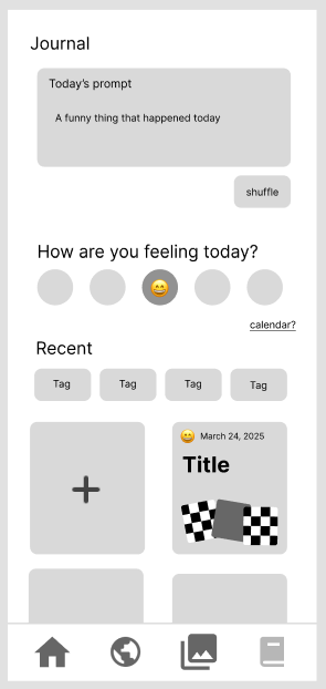
The journaling page would prompt the user to journal about their trip, and to rate their emotions on a scale.
A basic sign up page was designed.
The home page contained information about the user, and their past memories from prior trips.
The geotagging page had a basic globe placeholder implemented and a place to enter the dates for the user’s trip.
The albums page aimed to organize the user’s albums according to trip, with a basic search feature for usability.
Low-Fidelity Iteration 1
The main pages I hoped to flesh out in our low-fidelity design were the login page, home page, travel map, journaling page and album. I believed that having these 5 pages encompassed addressing our user pain points which will be explained in detail with each associated wireframe
Design
For the final low-fidelity we implemented the following:
The layout of the home page was changed to display more of the user’s previous trips and to show a memory from a past trip displayed at the top of the page.
The geotagging (trip map) page would display the active trip at the time and all past trips in the forms of albums with associated information displayed.
The album page contained each photo album for the trip, and the journal trip would also contain it’s own ‘albums’ containing the user’s journaling entries and other information from the journaling page.
For a detailed view of the flow for each page, please visit the link above to the Figma and navigate to ‘Low/High Fidelity’.
Final Low Fidelity
design system
High Fidelity
To start the process for high fidelity, I iterated through various color combinations, and typography. I discussed with my team to arrive at the final design decision.
I wanted a clean and professional, yet fun and colorful app to get our users excited to travel and document their memories. My team and I decided on a color scheme with cool toned blues, and bright oranges and yellows. The final decision for the color scheme can be seen below.
Final Design (High Fidelity Prototype)
Above are a few screens from the final prototype. I opted for minimalistic color implementation, but still adding pops of color for emphasis when necessary. The full user flow and prototype can be viewed at the Figma link included to the right.
CHallenges
Conclusion
My team presented our design at the end of the year celebration to all of the other DFA teams. The full presentation can be seen to the right. I think that the final product that we produced was definitely what we had envisioned, but it took a lot of time getting there. Within DFA there were Autumn initiated teams and Winter initiated teams. My team started in Winter which meant that we had three months less to complete our project than some other teams.
Each member that was admitted into our DFA team went through an interview process and made a time commitment to regularly attending meetings. Unfortunately, two of the members on our team stopped showing up at a certain point in the project which made it difficult to meet our goals and make the same amount of progress. This behavior continued for a few weeks and we had to make a judgement call. We onboarded two new members, and continued developing our design as planned. The new members we added to our team turned out to be very hard workers and supplemented the skills on our team very well. This just came to show that not everything always goes according to plan and adapting along the way is sometimes necessary. I am grateful for this learning opportunity as it taught me how to respectfully deal with such situations
At the end it felt a bit rushed, but with a collaborative effort, we were able to pull it all together. Keeping this in mind, I would like to continue working on this project to further refine the design and to flush out the features completely. I felt as though there was a lot going on within the app, which was partially intentional since the emphasis was on making this app unique, but my team sometimes got lost in the user flows. Overall this was a super fun project, and having a great team added to the fun of it!


